Project Connect

Designing a new product from concept to high fidelity prototype

About the Project

Project Connect is a networking and collaboration platform aimed at photographers, stylists, and other creative professionals.

Timeline: 3-week design sprint
UX team: 2 person team
Project Scope: Conceptual design project made in collaboration with a team of software engineering students which culminated in handoff of high fidelity Figma prototypes and style guide.
My Roles:
  • User Interviews
  • Competitive & Comparative Research
  • Product Feature Design
  • User Flows
  • UI Design & Wireframes
  • Figma Prototyping

Discovery & Research

User Interviews

My research objective was to understand the actions creative professionals take when organizing collaborative non-commercial projects such as portfolio, editorial, or personal projects. User interviews included 7 creative professionals whose creative roles covered photographer, model, makeup artist, designer, wardrobe stylist, visual artist, and event organizer.

  • How do creatives go about finding and connecting with new collaborators?
  • Do they have an existing network of other creatives? If so how do they manage those contacts and stay in touch?
  • What sites or tools do they currently use? How do they feel about those existing tools?
Interview Key Takeaways
  • No one platform does it all
  • Participants are willing to using multiple platforms for niche functions
  • Instagram and Model Mayhem were most popular but had mixed feedback
  • Search options often lacking when actively searching for collaborators
  • Missing messages is a problem when using multiple platforms
  • Too much back and forth on scheduling was a key pain point that could derail projects
  • Ability to post an “open call” for collaborators was important for most
  • Seeing a potential collaborator's portfolio site was important

Competitive & Comparative Analysis

I conducted a Feature Analysis with a range of popular creative networking and portfolio oriented platforms, including those used by interview participants.

Instagram
Meetup
Model Mayhem
Deviant Art
Flickr
Upwork
Baseline features assessed
  • User accounts and user profiles
  • 1:1 messaging between users
  • Alerts and notifications
  • Search functionalities
  • Browse options
  • Image galleries and image upload
Opportunities selected for MVP
  • Event or project listings
  • Create and post a project idea
  • Scheduling functionalities
  • Keyword tagging

User Persona - Meet Jacob Ryan

Jacob needs an efficient way to connect and communicate with potential collaborators so that creative projects don't lose momentum in the planning stage.

How might our platform:
  • Help collaborators find or attract relevant creatives to join their project.
  • Minimize scheduling and logistical hurdles when organizing a group project.
  • Make communication between collaborators clear and simple.

My UX team shared our research results, primary persona, and problem statements with the software engineering team at the end of week 1 and started brainstorming product ideas referencing our competitive feature analysis.

Product Feature Design

For our initial low fidelity designs we prioritized our four essential MVP features: Project Hubs, User Profiles, Search Features, and Messaging. We conducted low fidelity usability testing to validate our overall concepts and gather feedback, and then moved into high fidelity wireframes informed by our tests.

Project Hub

The key feature at the heart of Project Connect is the concept of creating a “Project”. I took inspiration from the C+C research, especially Meetup, and imagined a "Project" as behaving something like a user group which members can join.

I mapped out user roles and functionality with feedback from the software team:

  • Project members are referred to as “Collaborators” in the UI.
  • The Project “Organizer” is the person who created the Project, and has admin-type capabilities such as editing all Project information, and approving members.
  • Interested Project Connect users can ask to join a Project via the “I’m Interested” button, or can be invited to join by the Organizer.

For the low-fidelity wireframe I organized the page into four key sections:

  • Project description section
  • “Looking For” section
  • Collaborators section
  • Image gallery

Usability test participants liked this concept overall, but some were unclear how to use the image gallery when the Project hasn’t happened yet. In my final designs I added text clarifying the purpose of the gallery to “Share inspiration images, ideas, mood boards, and more with your Collaborators”.

Initial low fidelity design established the key page sections.
Jacob views a Project page. He can ask to join as Videographer via the “I’m Interested” button, or message the Organizer for more information.
Jacob’s own newly created Project, looking for Collaborators. Jacob appears as the Project Organizer, and can invite other users to join in specific roles.

User Profile

User Profile pages were a baseline feature from the C+C research. But what information should be prioritized in the Profile to align with the focus of Project Connect in meeting Jacob’s needs?

For the low-fidelity wireframe I organized the page into three key sections:

  • “About Me” profile information
  • Projects carousel
  • Image gallery

Since Project Connect is centered around creating and joining Projects, I prioritized a carousel feature highlighting Jacob’s current and past Projects with links to those Project pages.

The creative professionals we interviewed felt it was important to dig into the portfolios of potential collaborators, but liked using personal websites and social platforms for that purpose. For this reason I included a simple Gallery feature intended to give a quick sample of Jacob’s creative style, but prioritized space for external portfolio and social links prominently in the top section of the page.

Initial low fidelity design established the key page sections.

For the final prototype I refined the layout and designed for different states of the same page. This included writing progressive onboarding text prompting new users to upload images, and create or join a Project to start creating!

Jacob views his Profile page immediately after signing up. There is no content in the Projects or Gallery sections yet.
Jacob views another user’s public Profile with content in the Projects and Gallery sections.

Find Projects and Collaborators

Research participants felt that good search and filtering features were important, and had mixed feedback about these features in existing platforms. The ability to search and filter by location was the most-requested option in user interviews.

In designing the Project and Collaborator capsule listings my goal was to include all the key information our user would want to see while avoiding a cluttered layout. I added dates and open roles to the Project listings in the final design based on user feedback in the low fidelity usability test.

I discussed search, filter, and sorting options with the software engineering team to ensure that the functionality I was envisioning could be built within their development sprint.

I eliminated some lower priority proposed features from the MVP during the design process due to time constraints and level of effort for the software team. This included additional sorting options, a feature for saving Projects to a bookmark or favorites list, and the option to have more than one Organizer per Project.

For the MVP search results are sorted alphabetically by Project title or Collaborator last name only.

Low fidelity Project Listing. Some features were deprioritized in final design.
Final Project Listing design features more details based on user feedback.
Final "Find Projects" page. I researched comparative design examples from e-commerce sites while refining the compact side filter design.
The “Find Collaborators” page follows a similar layout with relevant filters. User-entered keyword tags and social links are featured prominently in the Profile Listings.

Message Center

My UX team discussed possible approaches to messaging with the engineering team and considered options such as live chat or inbox-style messaging. The teams decided together to built a basic inbox-style message system for the MVP because this was feasible for engineering to built within the project sprint while meeting user needs.

The initial prototype include a specialized “confirm availability” feature in the messaging system when requesting to join a Project to address pain points around scheduling that emerged in user research.

Usability test participants liked the idea of confirming availability with a dedicated form, but were confused by the layout in the original low fidelity prototype.

The final high fidelity Message Center adds visual cues and copy to make the reply options clearer. Jacob can select dates and send a simple request to join the Project, or can start a conversation with the Organizer to find out more.

Usability testers thought the availability confirmation feature was a helpful idea but presented in a confusing way in the low fidelity prototype.
Jacob confirms his availability dates and sends a Request to Join "A SuperAwesome Project".

Design System

Based on our comparative research we planned to ultimately offer both light and dark theme options. For our MVP site we prioritized the dark theme and tabled the light theme as a next step.

We took inspiration from the Material Design dark theme recommendations (https://material.io/design/color/dark-theme.html) to guide us in our color and design choices. We tested potential color and text combinations for accessibility using a free contrast checker from WebAIM.org before arriving at our final color palette.

We sourced fonts from Google Fonts library. We chose Open Sans for our main text font for a simple clean look that would scale well, and Raleway for our header font. The "Project Connect" logo uses the display font Major Mono, selected for its distinctive letter variations.

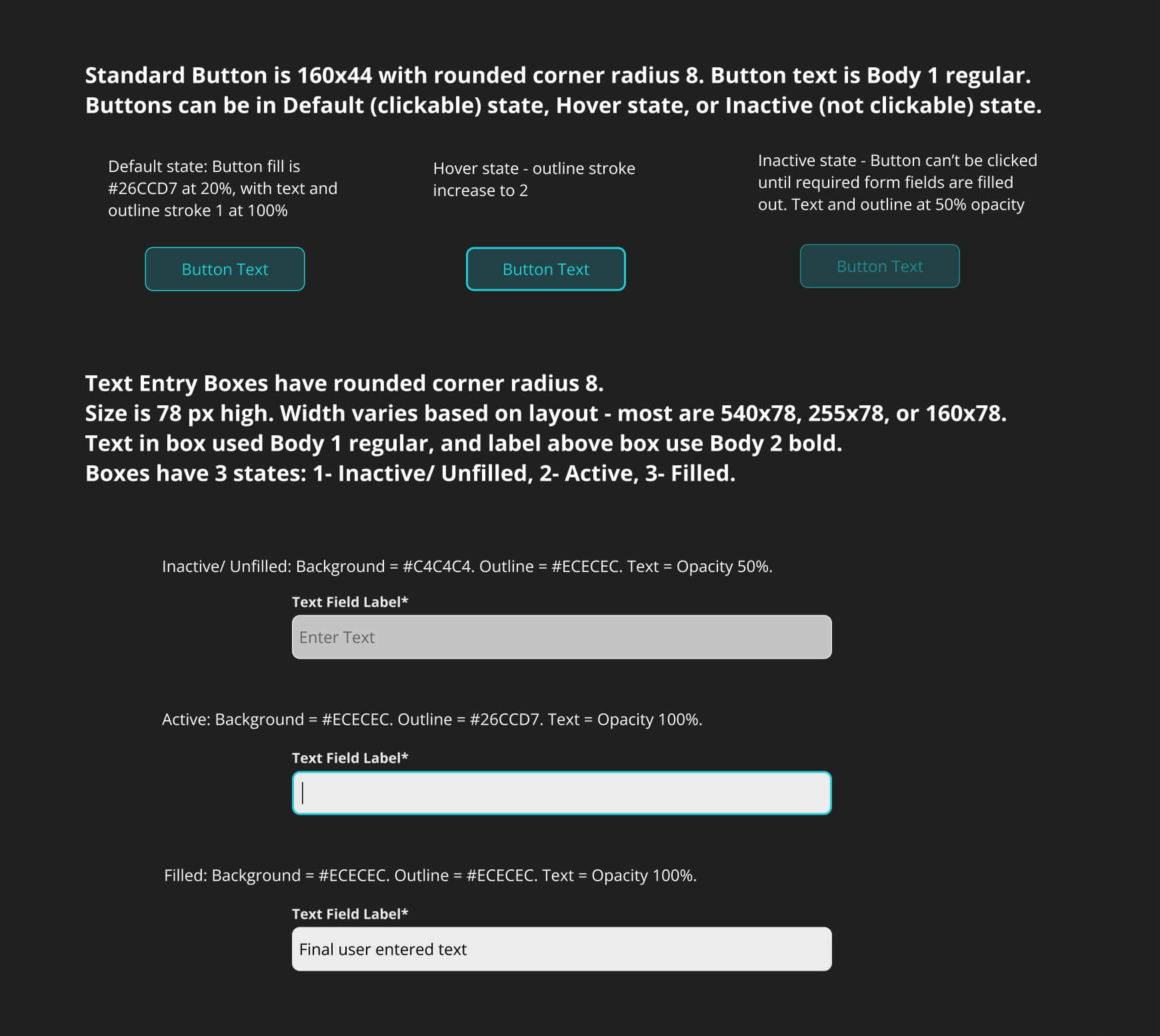
In additional to complete high fidelity wireframes, the final deliverables to the engineering team included annotation on some key design components that might be less clear in the wireframes. Below is the reference I created for the engineering team explaining the different states of our standard buttons and text boxes.

Next Steps

During the course of our 3-week design sprint we found that we needed to table development on some secondary features to better focus our time on designing and building the details of our core product features. These features would be addressed in the next phase of product development.

Next steps:
  • Refine new user sign-up and new project creation steps with further usability testing
  • Create feature for saving and managing Collaborator contacts
  • Fully develop mobile-optimized version of site with focused user research and testing
  • Add Sorting options to Find Projects and Find Collaborators pages

Let's Work Together!

Reach out in the contact form below or find me on LinkedIn.

Thank you! Your submission has been received!
Oops! Something went wrong while submitting the form.